 Monday Today we were introduced to the new module, ‘Art Space and Audience’. In essence, it is an art review and critiquing module, where we are to eventually produce a seminar presentation, as well as a 1000-word review of an exhibition. The exhibition being reviewed is to be chosen by staff in the coming weeks. I am looking forward to getting in to this module. It is very similar to work we produced in the first year of the HND course. Hopefully that experience will aid me in this module. At 4pm we had the re-arranged lecture ‘Artist as a Global Citizen’ which was delivered by Head of School, Professor Jonathan Harris. Unfortunately, there was a technical glitch and the accompanying PowerPoint presentation didn’t work, so it was borderline seminar in delivery and interaction. His points on the differences between Modernism / Avant-Garde / Contemporary art were particularly interesting to me, something which I made a note of for future research. Tuesday The group tutorial today was adapted in to an individual tutorial on the basis that nobody in my group was in, other than Emily. I spoke with Lois about my progression, and on the back of some of which we discussed, was suggested to watch a 4-part series by John Berger called ‘Ways of Seeing’. Luckily, all four parts have been compiled and uploaded to YouTube. Wednesday The assessment briefing with Fran was helpful, it explained a lot of points which I had queries about. It confirmed that we do need to produce a self-evaluation and that it can be directly linked to the statement of intent document that was produced in September (both of which need to be printed off and kept with all practical work presented).  In the afternoon prior to the briefing, I spent the time looking through the last editions of the year of both Stylist and Shortlist magazine.  Originally, my intention was to use these for future collages – go through the usual process of selecting images, tearing out pages and leaving them all together in a tray. After watching the John Berger programmes, I was inspired to look at the magazines in a different mind-set. I started by comparing the advertisements on one page, to the page opposite or following. There was no particular pattern or obvious inspiration from this process. After a second skim through both, I realised that effectively the magazines are Male/Female orientated, male being Shortlist, female being Stylist. This might be a glaringly obvious fact that I’d never realised or considered before, but that in itself got me thinking…  “FOR MEN WITH MORE THAN ON THING ON THEIR MINDS” The subheading in each weekly edition of Shortlist is always the same. To me, it seems rather forceful, borderline aggressive. Is it really essential to reinforce that it’s specifically for men? Are the articles and advertisements focused at men as directly as the subheading would lead you to believe? Stylist and Shortlist magazines are handed out at an almost rapid-fire rate around the city, to anybody who wilfully accepts the magazine thrusted in their direction. The distributors have no pre-determined strategy to target a specific gender. Yet, the contents are gender-orientated. I dissected both magazines to try and find any similarities, or even abnormalities.  I grouped together the front covers, advertisements, articles and interviews. Immediately there was a stark contrast between Stylist’s front cover (near left, woman and cat side profile) and Shortlist’s (next to formerly mentioned, illustration of male superhero). There is an obvious male/female contrast, but also relationships between the sleek and stylised vs comic book, illustrated and brightly coloured. There were also striking differences between articles relating to food. Stylist (women) are given a 3-page walkthrough of seasonal ‘on-trend’ and ‘hipster’ foods which are entirely health conscious and vegetable based. Shortlist (men) are offered a double-page spread of a monstrous triple-decker entitled ‘HANGOVER-BUSTING BOXING DAY SANDWICH’. Thursday On the commute this morning I managed to acquire the most recent copies of Stylist and Shortlist magazine. As a precaution, I didn’t want to be in a situation where this could be a continued documentation and I’d be missing an edition, so I called Shortlist magazine to ask whether there was one published the first week of January. Luckily for me, it was too early in the year so the one this week was indeed the first edition of the year. Interestingly, Stylist ran an additional edition the week before Christmas 2016. Women were in a position to receive more up-to-the-minute fashion advise and trends than men. From the pages compiled yesterday, I selected 10 of each which I found to be interesting to the theme. The pages aren’t exact in shape and size, so I devised a guideline for trimming them down in preparation for display. The thought processes from notebook:  After considering the composition of the pages (male/female, advertisements, contents, aesthetics) I mounted the pages on my studio space wall. I opted to mount with Blu-Tac so that moving them around was an option, and eventually mounting on to a board. 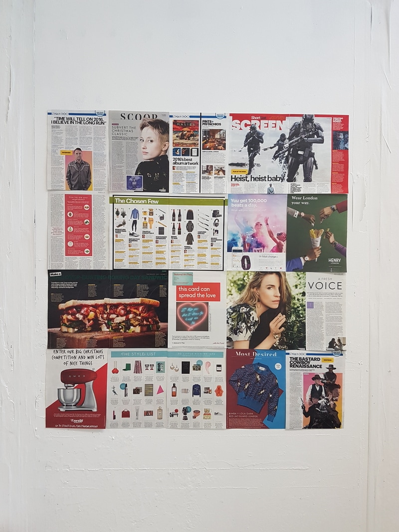 I moved on to looking through the first two 2017 editions of both magazines, repeating the process as before in order to reduce them down to a selection of pages complimenting the theme.  At this point, I had two collections of pages. One from the last editions of 2016, the other the first editions of 2017.   I took the decision to merge them together. I think together they’re a strong piece in terms of content and also visually.  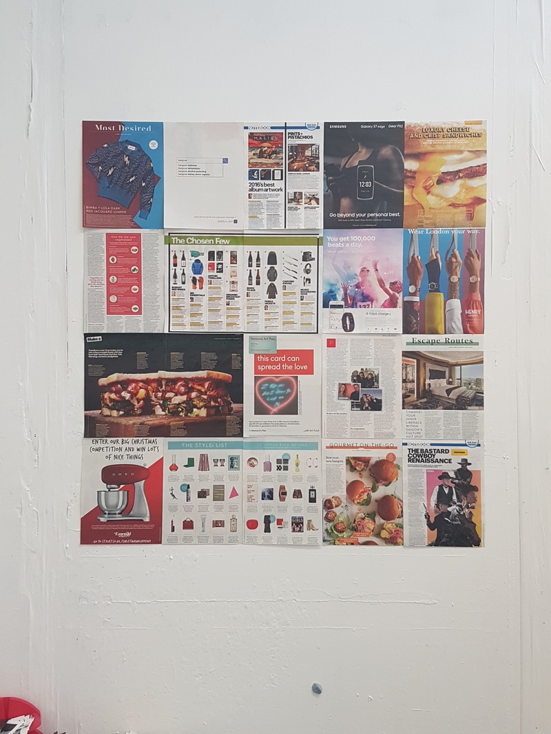 When looking at the chosen pages, feelings of confusion, frustration and imbalance arise. Based on the four editions of the magazine, men are offered large images of unhealthy food, whereas women are presented with gourmet, health-conscious meals. In advertising, the lines between male, female and neutral are completely blurred. *For reference, the pages above read as 1 2 3 4 5, next row being 6 7 8 9 10, and so on…
It’s important to keep in mind after reading through the bullet points above, that Stylist and Shortlist are the same company. Perhaps I’m naïve in my thinking, but collaborating with one another wouldn’t be completely unthinkable. I can imagine that there’s an argument for repetition in content, but that doesn’t seem to be an issue with advertisements. I really enjoyed curating this piece. The process felt like an archiving task, and having a concept as the foundation of the creation, rather than (in my collage work) playfully experimenting and arriving at a conclusion. I intend to continue with this concept. Comparing the male and the female, the appropriateness of advertising and content. Friday I used the morning to source a framing company online, which could meet my needs. I narrowed down my collages to 7, of which I’m going to display for assessment. They will be three mini-series and one stand-alone collage. I found a quote online for £124.00. I promptly ordered, to then read the fine print that they would take ten working days for delivery. In hindsight I should have sorted the frames out before the Christmas break. I cancelled the order. I spent the late morning trimming the collages down, so that they relate in both theme and size. It would be easier (I imagine) for the framing company to cut frames and glass to size with images that (excluding mount) are for example 300x300mm rather than 327x334mm. I visited a local (to my home) framers in the afternoon to discuss the framing, pick the style and colour of the frame and also mount. The turn-around time for this would be 5 days at a total cost of £134. This also included a 106x100cm foam board for the Stylist/Shortlist piece. 
0 Comments
|
ArchivesCategories |
 RSS Feed
